
Graphic Design Principles Explained: A Beginner-Friendly Guide
Graphic design looks simple from the outside. A logo here. A poster there. A clean website layout. But once you try designing something yourself, reality hits fast. Suddenly, choosing colors feels stressful. Fonts don’t work together. Spacing feels off. And no matter what you do, the design just doesn’t look right.
This is where most beginners get stuck.
The problem isn’t creativity. It’s not a lack of tools either. The real issue is missing fundamentals. Every strong design follows a set of invisible rules called graphic design principles. These principles shape how visuals are organized, understood, and experienced.
Once you understand them, design stops feeling random. You start making choices with confidence. You know why something works and why something doesn’t.
This guide explains graphic design principles in a simple, beginner-friendly way. No complicated theory. No academic language. Just clear explanations, practical examples, and design basics you can apply immediately.
What Are Graphic Design Principles?
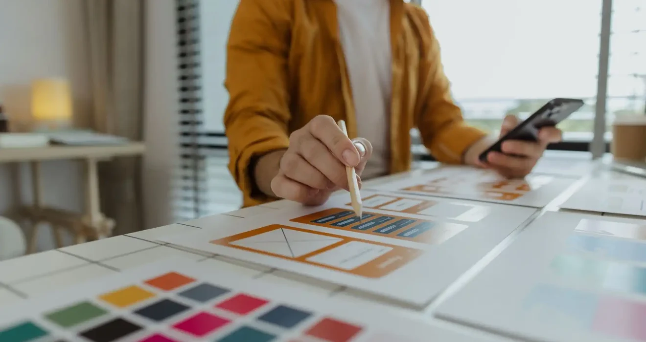
Graphic design principles are guidelines that help designers arrange visual elements effectively. They control how text, images, colors, and shapes interact within a design.Think of them as the rules that bring order to creativity.
You can use the same colors, fonts, and images as a professional designer. But without understanding the principles, the result will feel messy or confusing. Principles turn raw elements into meaningful visuals.
They help answer questions like:
- Where should the viewer look first?
- What feels balanced?
- What feels connected?
- What feels out of place?
These principles exist in every form of visual design, whether it’s a logo, website, social media post, or presentation slide.
Graphic Design Principles vs Design Elements
This is where many beginners get confused.
Design elements are the ingredients.Graphic design principles are the recipe.Design elements include color, typography, shape, line, texture, space, and images. They are the things you place on the canvas.Graphic design principles explain how to organize those elements so they work together instead of fighting for attention.You can’t ignore either. But principles are what separate amateur designs from professional ones.
Why Graphic Design Principles Matter for Beginners
When beginners skip design fundamentals, the results often feel chaotic. Text blocks look disconnected. Colors feel overwhelming. Important messages get lost.Graphic design principles solve this.They bring clarity. They create structure. They help designs communicate clearly without explanation.
Even the simplest design can look polished when the principles are applied correctly. And even complex designs can feel effortless when the fundamentals are strong.Learning design basics early also saves time. Instead of endlessly tweaking designs, you make intentional decisions from the start.
How Good Design Influences Perception
People form opinions about visuals instantly. Within seconds, they decide whether something looks trustworthy, modern, outdated, or confusing.Balanced layouts feel calm and reliable.Clear visual hierarchy feels professional.Consistent design feels intentional.Good design builds trust without saying a word. And that trust comes from applying graphic design principles consistently.
The Core Graphic Design Principles Explained
Let’s break down the most important graphic design principles every beginner should understand. These principles appear in nearly every successful design you see.
Balance in Design
Balance in design refers to how visual weight is distributed across a layout. Every element carries weight based on its size, color, contrast, and position.
When a design is balanced, it feels stable. When it’s unbalanced, it feels uncomfortable or unfinished.Balance doesn’t mean everything has to be equal. It means everything feels intentional.
Types of Balance in Graphic Design
- Symmetrical balance places equal elements on both sides of a central axis. It feels orderly, formal, and predictable. This type of balance is common in traditional branding and formal layouts.
- Asymmetrical balance uses different elements that still feel equal in visual weight. A large image on one side might be balanced by bold text on the other. This style feels modern and dynamic.
- Radial balance arranges elements around a central point. Think of circular logos or designs that radiate outward. It naturally draws attention to the center.
Understanding balance in design helps you control how calm or energetic your layout feels.
Visual Hierarchy
Visual hierarchy determines the order in which viewers notice elements. It answers one critical question: What should be seen first?
Without hierarchy, everything screams for attention. With hierarchy, the viewer’s eye moves smoothly through the design.Strong hierarchy makes designs easier to understand and more enjoyable to look at.
Ways to Create Strong Visual Hierarchy
Size is one of the most powerful tools. Larger elements feel more important.Color and contrast also play a big role. High-contrast elements attract attention faster than subtle ones.Typography matters too. Bold fonts feel stronger than light ones. Headlines stand out from body text.Spacing helps define importance. Elements with more surrounding space feel more significant.
When hierarchy is clear, your message becomes effortless to read.
Contrast
Contrast is the difference between elements. Light versus dark. Large versus small. Bold versus subtle.Contrast improves readability. It prevents designs from feeling flat or confusing.When contrast is weak, everything blends together. When it’s strong, important information stands out clearly.
Contrast isn’t just about color. It applies to typography, shapes, spacing, and layout choices as well.Used correctly, contrast creates focus and energy.
Alignment
Alignment connects elements visually. When items line up properly, the design feels clean and intentional.Poor alignment creates tension. It makes designs feel sloppy, even when the content is good.Alignment helps guide the viewer’s eye and creates invisible connections between elements.Even when elements are far apart, alignment makes them feel related.
Repetition
Repetition creates consistency. It repeats visual elements such as colors, fonts, shapes, or styles across a design.This principle strengthens branding and helps viewers recognize patterns. It also makes designs feel cohesive instead of random.Repetition doesn’t mean copying everything exactly. It means maintaining a consistent visual language.
Good repetition builds familiarity. Familiarity builds trust.
Proximity
Proximity refers to grouping related elements together. Items that belong together should be placed close to each other.This principle improves clarity and organization. It helps viewers understand relationships without needing explanations.Good proximity reduces clutter and improves scanning. Bad proximity creates confusion.Spacing is not empty space. It’s a powerful communication tool.
Common Beginner Mistakes When Applying Design Basics
Most beginners make similar mistakes. They use too many fonts. They overuse colors. They ignore balance in design. They don’t establish a clear visual hierarchy.These mistakes don’t mean you’re bad at design. They mean you’re still learning.Design basics take time to sink in.
How to Fix These Design Mistakes
Limit your font choices to two or three. Use contrast intentionally instead of randomly. Step back and assess balance. Ask yourself where the eye goes first.
- Small adjustments often transform a design completely.
- Learning graphic design principles is about awareness more than perfection.
Practical Tips to Practice Graphic Design Principles
The best way to master graphic design principles is through consistent practice.Start small. Design simple layouts. Recreate designs you admire. Analyze what makes them work.
Pay attention to spacing. Notice how hierarchy guides your eyes. Observe balance in design across different formats.Over time, these principles become second nature. You’ll start spotting good and bad design everywhere.
That’s when real growth begins.
Graphic Design Principles in Real-World Projects
Graphic design principles apply to every type of visual work.
Logos rely on balance, contrast, and repetition.
Websites depend heavily on hierarchy, alignment, and proximity.
Social media graphics use contrast and repetition to stand out quickly.
Presentations rely on spacing and hierarchy for clarity.
Once you understand the fundamentals, adapting them to different projects becomes easier.The principles stay the same. The execution changes.
Final Thoughts on Mastering Graphic Design Principles
Graphic design principles are the foundation of effective visual communication. They turn creativity into clarity.You don’t need expensive tools or formal education to start applying them. You just need awareness, practice, and patience.Focus on design basics. Respect balance in design. Build a strong visual hierarchy. Understand design fundamentals deeply.
As you practice, your confidence will grow. Your designs will improve. And most importantly, you’ll understand why they work.
That understanding is what truly makes you a designer.
FAQs
What are the most important graphic design principles?
Balance, visual hierarchy, contrast, alignment, repetition, and proximity form the core foundation of effective design.
How long does it take to learn design basics?
You can understand the basics within weeks, but mastering design fundamentals takes consistent practice over time.
Can beginners learn graphic design principles without formal training?
Yes. Many successful designers are self-taught through practice, observation, and applying principles consistently.