
Why is balance considered the most critical among all design principles?
When people first start learning design, they usually hear about a long list of principles. Balance, contrast, hierarchy, alignment, repetition, proportion, emphasis, white space, the list goes on.
And while each one matters, one principle often sits at the center of everything else:
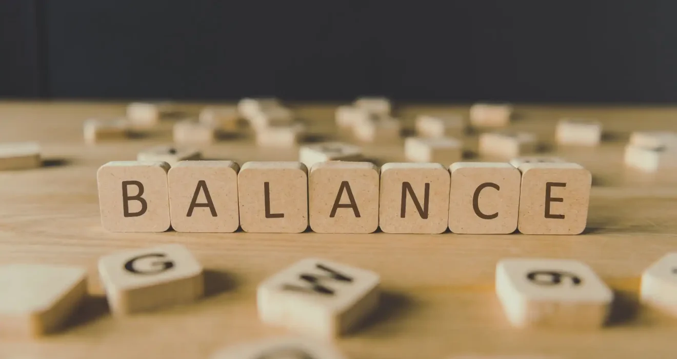
Balance
That may sound simple, but balance does a lot more than just make a design “look nice.” It affects how people feel, understand, and move through a design. It shapes whether something feels calm or chaotic, clear or confusing, polished or unprofessional.
So, why is balance considered the most critical among all design principles?
Because balance is what helps a design feel stable, intentional, readable, and visually trustworthy. It creates the structure that allows every other design principle to work better. Without balance, even beautiful colors, strong typography, and clever layouts can fall apart.
Let’s break down why this principle matters so much, and why designers keep coming back to it in everything from branding to websites to print layouts. Balance helps distribute “visual weight” across a composition, while hierarchy and spacing guide attention and reduce confusion. In visual and UX design, these principles work together to make content easier to scan and understand.
What Does Balance Mean in Design?
In design, balance is the way visual elements are arranged so that no part of the composition feels too heavy, too empty, or too distracting.
Every element in a design carries some kind of visual weight.
That weight can come from:
-
Size
-
Color
-
Shape
-
Position
-
Texture
-
Contrast
-
Spacing
-
Typography
A large bold headline, for example, has more visual weight than a small line of text. A bright red object often feels “heavier” than a pale gray one. A crowded corner can pull attention more strongly than a clean open space.
Balance is what helps all of those elements coexist without fighting each other. It is not always about symmetry. It is about visual equilibrium. And that equilibrium matters more than most people realize.
Why Balance Matters Before Anything Else
A design can have:
-
Great typography
-
Strong imagery
-
Beautiful colors
-
A clear message
but if it feels visually “off,” people notice it immediately.
Sometimes they cannot explain why.
They just feel that something is:
-
awkward
-
cluttered
-
too empty
-
hard to follow
-
uncomfortable to look at
That reaction often comes down to poor balance.
Balance is one of the first things the human eye responds to. Our brains naturally try to organize what we see into something coherent and stable. That’s one reason Gestalt principles are so useful in design: people instinctively group, separate, and interpret visual elements as unified patterns rather than isolated pieces.
When a design lacks balance, it creates subtle tension, and not always in a good way.
That is why balance is often considered foundational. It is one of the core principles that helps viewers feel that a design makes sense.
Balance Creates Visual Stability
One of the biggest reasons balance is so important is because it creates stability.
A balanced design feels grounded. It gives the viewer a sense that the composition is under control.
This is especially important in things like:
-
Websites
-
Posters
-
Social media graphics
-
Product packaging
-
Presentations
-
Brand materials
If the layout feels unstable, the message can feel unstable too.
And that has a direct effect on how people perceive professionalism and trust.
A stable design often feels:
-
More polished
-
Easier to understand
-
More trustworthy
-
More intentional
-
More comfortable to engage with
This matters even more in digital design, where users make snap judgments very quickly. If a page feels messy or visually unbalanced, users may leave before they even process the content.
That is how powerful balance can be.
Balance Helps the Eye Move Naturally
Good design is not just about what people see. It is also about how they move through what they see.
This is where balance becomes incredibly useful.
A balanced layout helps guide the viewer’s eye from one part of the design to the next in a way that feels natural.
That supports:
-
Better readability
-
Stronger visual flow
-
Easier navigation
-
Less mental fatigue
When balance is missing, the eye can get stuck.
Sometimes one part of the design becomes too dominant. Other times, everything competes for attention at once. Either way, the viewer has to work harder than they should.
And in design, friction usually weakens communication.
That is one reason balance supports visual hierarchy so strongly. A clear focal point needs a balanced composition around it, or the viewer loses the path through the rest of the layout. Designers use focal points, spacing, and organized structure to create a clear visual flow instead of a cluttered one.
Balance Makes Other Design Principles Work Better
This is one of the strongest reasons balance is often considered the most critical principle.
It supports almost every other principle.
For example:
1. Balance and Contrast
Contrast helps important elements stand out. But without balance, contrast can feel too aggressive or chaotic.
2. Balance and Hierarchy
Hierarchy helps show what matters most. But if the design is unbalanced, hierarchy can become confusing instead of helpful.
3. Balance and White Space
White space creates breathing room. But if space is distributed poorly, the layout can feel empty or disconnected instead of clean.
4. Balance and Emphasis
Emphasis draws attention to one key area. But if too much visual weight is placed in one spot, the design can feel lopsided.
That is what makes balance so powerful.
It is not always the loudest design principle, but it is often the one that holds everything together.
A Design Can Be Beautiful and Still Fail Without Balance
This is a common mistake, especially among beginners.
A design may include:
-
trendy fonts
-
elegant color palettes
-
high-quality images
-
premium branding
And yet it still does not work.
Why?
Because visual appeal alone is not enough. A design also needs structure.
Balance is what turns random good-looking elements into a composition that feels cohesive.
Without that structure:
-
attention gets scattered
-
key information gets lost
-
readability suffers
-
the message weakens
This is especially common in social media graphics and website layouts, where people often try to include too much.
When everything wants to be seen first, nothing truly stands out. Balance solves that problem by controlling how visual weight is distributed.
Balance Improves Readability and Usability
One of the most practical reasons balance matters is that it improves how easy something is to use and understand.
This is especially important in:
-
UX design
-
UI design
-
landing pages
-
forms
-
presentations
-
brochures
-
educational content
A balanced design makes information easier to scan.
That means users can more quickly understand:
-
what they are looking at
-
where to focus first
-
what belongs together
-
what action to take next
This is not just about aesthetics. It is about communication. If a design is hard to read, hard to navigate, or visually tiring, it has already lost part of its purpose.
That is why strong balance often improves both beauty and function at the same time.
Types of Balance in Design
Balance does not always mean splitting everything evenly down the middle. In fact, some of the strongest designs are not symmetrical at all.
Here are the main types of balance designers use:
1. Symmetrical Balance
This is when elements are evenly distributed on both sides of a central axis.
It often feels:
-
formal
-
elegant
-
calm
-
classic
-
structured
Symmetrical balance works well in:
-
luxury branding
-
invitations
-
editorial layouts
-
traditional design styles
It gives a strong sense of order.
2. Asymmetrical Balance
This is when different elements are arranged in a way that still feels balanced, even though they are not mirrored.
For example:
-
a large image on one side
-
balanced by smaller text and white space on the other
Asymmetrical balance often feels:
-
modern
-
dynamic
-
creative
-
more natural
It is very common in web design and modern branding.
And when done well, it can feel more interesting than symmetry while still staying visually stable. Designers often use asymmetrical balance by offsetting a heavy element with smaller items, spacing, or negative space so the layout still feels even.
3. Radial Balance
This happens when elements are arranged around a central point.
It is less common, but it can be very effective in:
-
logos
-
icons
-
infographics
-
circular layouts
It creates a strong focal center and can feel very intentional when used correctly.
Why Humans Naturally Respond to Balanced Design
There is also a psychological side to this. Humans naturally prefer order over confusion.
We tend to feel more comfortable when visual information is organized in a way that feels coherent. That is part of why principles like proximity, similarity, figure-ground, and grouping are so effective. They align with how the brain already tries to simplify and structure what it sees.
Balanced design often feels:
-
safer
-
calmer
-
easier to process
-
less mentally exhausting
That does not mean every design must feel “perfectly peaceful.” Some designs intentionally use imbalance to create tension or energy.
But even then, that tension usually works best when it is controlled, not accidental.
In most communication-focused design, balance helps reduce cognitive overload. And that matters more than ever today, when people are constantly scrolling, scanning, and making quick decisions.
Balance Is What Helps a Design Feel “Finished”
Sometimes a design is technically complete, but it still does not feel done.
That is often a balance issue.
You might have:
-
too much empty space at the bottom
-
a heavy image pulling one side down
-
text blocks that feel awkwardly placed
-
buttons that do not sit comfortably in the layout
Nothing is necessarily “wrong” on its own. But the composition does not feel resolved. When balance is right, the design often feels complete.
That is why experienced designers constantly make small adjustments to:
-
spacing
-
alignment
-
scale
-
positioning
-
grouping
These details may seem small, but they have a huge effect on the overall feel of the piece.
And often, what they are really doing is improving balance.
How to Improve Balance in Your Own Designs
The good news is balance can be trained. You do not need to rely only on instinct.
A few practical ways to improve balance:
1. Step Back and Squint
This helps you notice where visual weight is collecting too heavily.
2. Check One Side Against the Other
Does one area feel too crowded, too dark, or too loud?
3. Use White Space Intentionally
Empty space is not wasted space. It often creates the balance your layout needs.
4. Reduce Competing Elements
If everything is bold, large, or colorful, balance disappears fast.
5. Think in Terms of Visual Weight
Ask yourself: what feels “heavier” here, and what is balancing it?
6. Use Grids and Alignment
Grids help create structure, consistency, and stronger layout balance.
These small habits can dramatically improve your design quality over time.
When Breaking Balance Can Work
To be fair, balance is not always about making everything calm and even.
Sometimes designers intentionally disrupt balance to create:
-
tension
-
urgency
-
drama
-
surprise
-
movement
This can work well in:
-
experimental posters
-
edgy branding
-
album covers
-
campaign visuals
But even then, strong designers usually know how balance works before they choose to break it.
That is the difference between intentional design and accidental mess. So even when balance is bent, it is still influencing the result. That alone says a lot about how important it is.
Conclusion
Balance does more than make a layout look attractive. It creates stability, flow, structure, readability, and trust. It helps people process information more comfortably. It gives every other design element a place to work effectively.
Without balance, even strong ideas can feel scattered. With balance, even simple designs can feel powerful. That is what makes it such an essential principle.
It may not always be the first thing people talk about when they look at a design. But very often, it is the reason the design works in the first place.